Meadow |
Bubbles |
Artist Statement
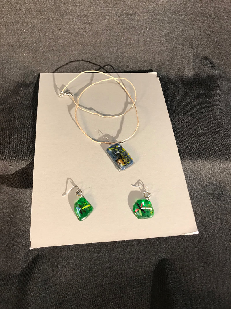
The piece on the left has two flower earrings and the pendent of the necklace was something I had initially designed for a partially infused piece, but during the process it had been fully infused. So I made some earrings that were simple but also some of the colors would match, so the pairing went with each other. For the earrings I had used scrap pieces and really small shards that had come off while I was cutting the pieces and sprinkled them along the bottom giving them the circle looks. Then I had taken small thin rods of glass to make the stems and the flower pedals, I didn't want to do to much for the shapes of the earrings because I wanted to add an abstract part to the project. A main element of art used for this piece was line but how all the lines for the flower brings the picture together, this connects to the principle of design rhythm because of how your eye moves around the piece following each petal. For the pendant on the necklace I had used the element of art was texture because the piece was fully infused but I had plied it so much that their were little bumps in the piece. This connects to the principle of design, emphasis on the parts of the piece with bumps. This is important for the artwork because without the bumps it would just look like a bunch of dots in random spots in the piece. The concept of the piece was to give the viewer a sense of abstract because of how unorganized the pendant on the necklace is. The piece was successful because I really enjoyed how the flowers had turned out and how well the looked, what I think needs improvement is how the pendant wasn't partially fused, I believe that if it was fully infused it would add a better sense of abstraction. I enjoyed creating these pieces because I was very excited to see the outcomes, I wish the project had went the way that I had planned but either way it was still fun and enjoyable to do.
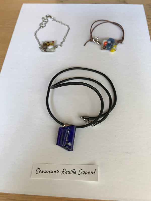
The piece on the right is the partially infused piece, I had made two bracelets made with all different colors, I went for duller colors for as a theme this time. I added a bunch of little dots because it was made to go with the picture on the left's pendant, but when it became a fully infused piece I decided to make a similar pedant but instead I used darker colors much like the bracelets. Then I had used a black leather string because I thought it had complemented the blue in the pendant. The key element I had used was color because I had chosen dark colors to match the pendants, this connects to the principle of design harmony because it units the entire piece. This is important because without it, it would just look like two sets of bracelets and a completely different necklace that doesn't relate to them at all. The concept of this project was to have something elegant and simple, the purpose was to have something that matches most outfits and is really simple but complex at the same time. I thought both bracelets were both really successful because they were just simple but look elegant what I believe needs improvement is the edges of the necklace because I didn't have enough time to smooth those sides down. I really enjoyed the way this project ended because I think the bracelets and the necklace all match well, and that the colors all go together and how the wrist parts of the bracelets turned out.
The piece on the right is the partially infused piece, I had made two bracelets made with all different colors, I went for duller colors for as a theme this time. I added a bunch of little dots because it was made to go with the picture on the left's pendant, but when it became a fully infused piece I decided to make a similar pedant but instead I used darker colors much like the bracelets. Then I had used a black leather string because I thought it had complemented the blue in the pendant. The key element I had used was color because I had chosen dark colors to match the pendants, this connects to the principle of design harmony because it units the entire piece. This is important because without it, it would just look like two sets of bracelets and a completely different necklace that doesn't relate to them at all. The concept of this project was to have something elegant and simple, the purpose was to have something that matches most outfits and is really simple but complex at the same time. I thought both bracelets were both really successful because they were just simple but look elegant what I believe needs improvement is the edges of the necklace because I didn't have enough time to smooth those sides down. I really enjoyed the way this project ended because I think the bracelets and the necklace all match well, and that the colors all go together and how the wrist parts of the bracelets turned out.
