My plan
My plan for this assignment was to take photos of different hands and limbs, and editing them by making the colors abnormal.
My photos
For this shoot I took a lot of different photos of other peoples hands in weird spots, experimenting
with how I can make the hand look. I took some of these outside against a brick wall and some in my car where we were practicing how to make the photo blurry around the main subject.
with how I can make the hand look. I took some of these outside against a brick wall and some in my car where we were practicing how to make the photo blurry around the main subject.
My edits
|
|
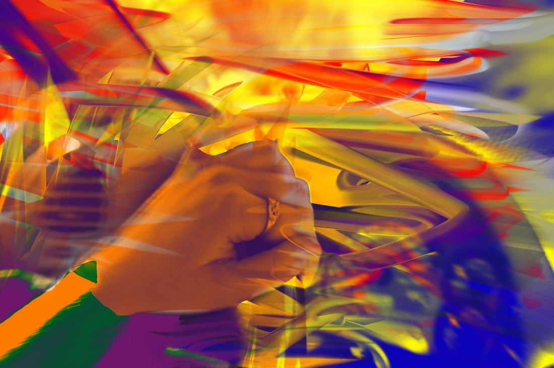
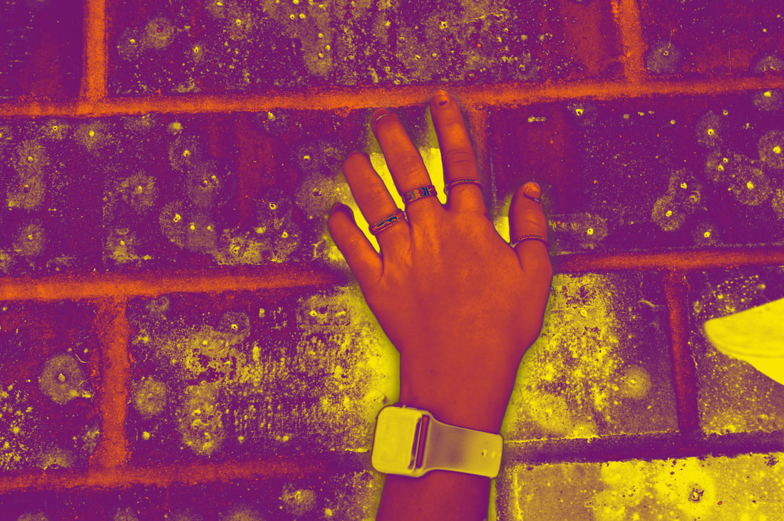
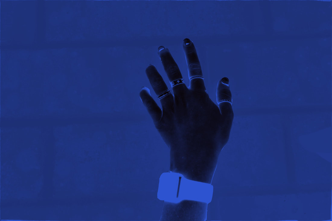
For this project I edited my photos using the gradient map either the whole photo and adjusting it as it was or taking different areas of the photo and making them different colors. The photo on the bottom left I had used the gradient map to make different sections different colors, then I used the smudge tool to make it look like the colors are morphing between each other. For the photo on the bottom right I had used the gradient tool to transform the entire photo to blue and black, then I adjusted the levels for both. The photo on the top right I had edited the hand first and adjusted the levels for each color then I did the same with the background. The photo in the top left I had used the saturation levels to change the colors of each sections, I chose the hand to remain black and white so it drew the viewer into something.
My printed photo
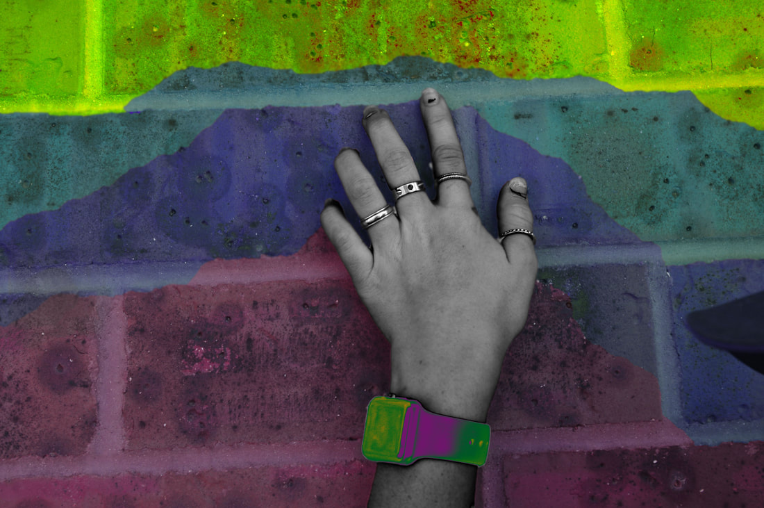
I had taken a photo of my friends hand up against a brick wall, I edited the hand to only be the colors of purple yellow and blue, I adjusted each color before doing the same thing to the background. I had used the feather and smudge tool to make the hand look like it's popping out of the picture. There are multiple rings on my friends finger and I was also able to capture her apple watch. I thought the color in the photo really stood out because I had used the same colors in both the wall and on the hand but I had made the hand a little bit brighter so it draws the viewers eye to the hand and the yellow in the photo. This emphasised on the outside of the hand because it all is a bright yellow making the hand look like it's popping off. This is important because otherwise the hand would just look like it's in the photo instead of giving the visual that it's popping out. I think this piece gives an older vibe with how bright the yellow is and the color of purple I had decided to use. I get also get the tone that it's like post apocalypse because of how everything is yellow around the hand, showing signs of radiations, along with the apple watch. and how the hand is light but not turned all the way yellow. I think this piece was successful because of how the yellow forms around the hand, and really makes it stand out against the rest of the piece. I think I could improve by using the gradient tool to really make the photo look rustic and like it's not from this era.
