My Project
This is the last part of my elements project, for water I wanted to take pictures of things that are blue, or that relate to water. Bailey had just done her nails a white blue ombre so it was perfect for this project.
My Photos
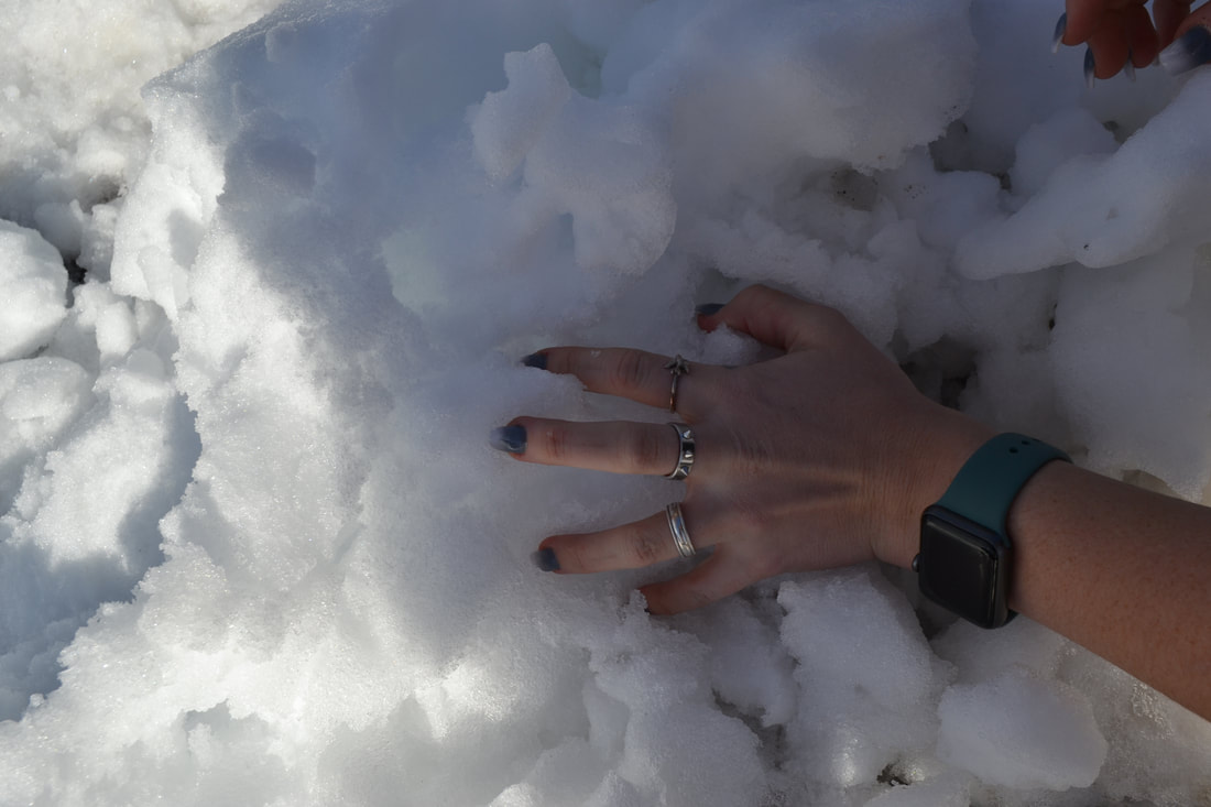
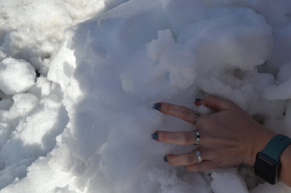
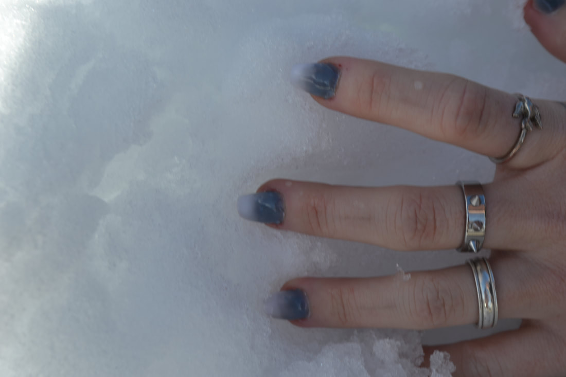
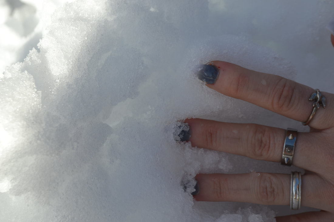
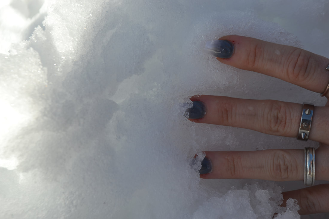
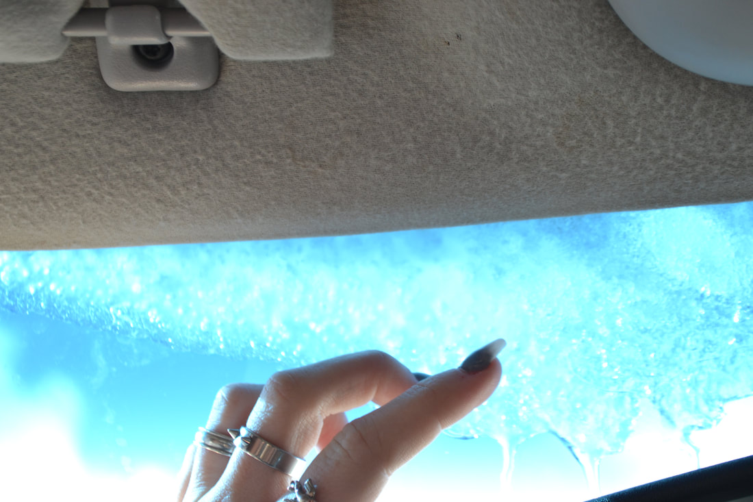
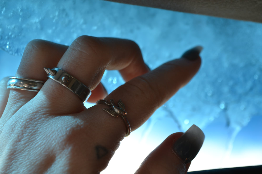
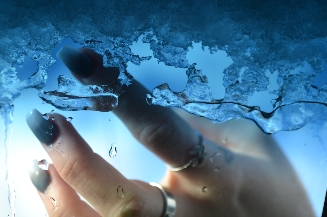
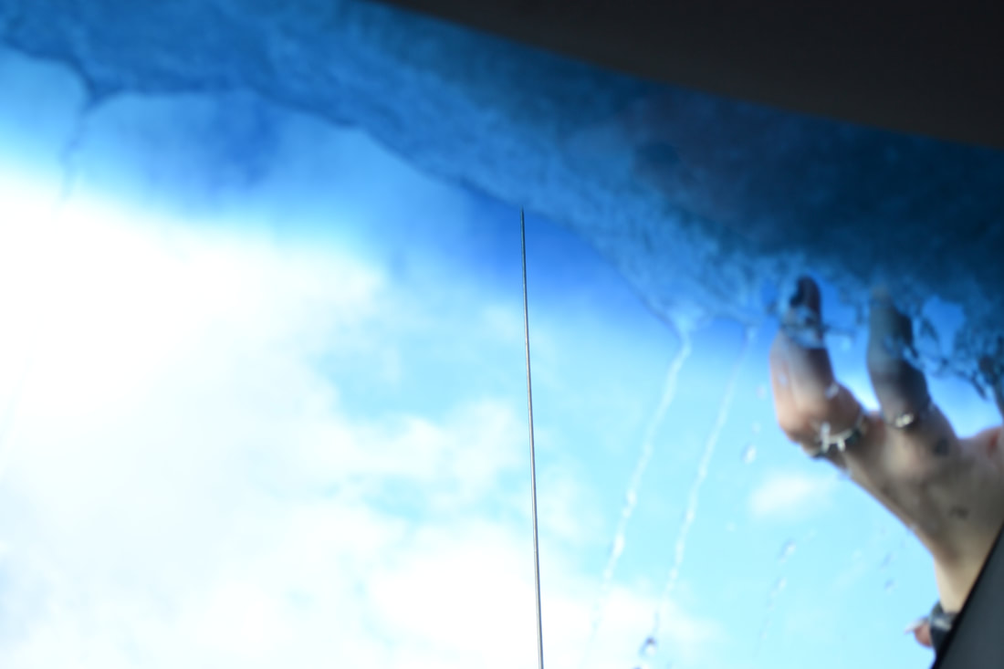
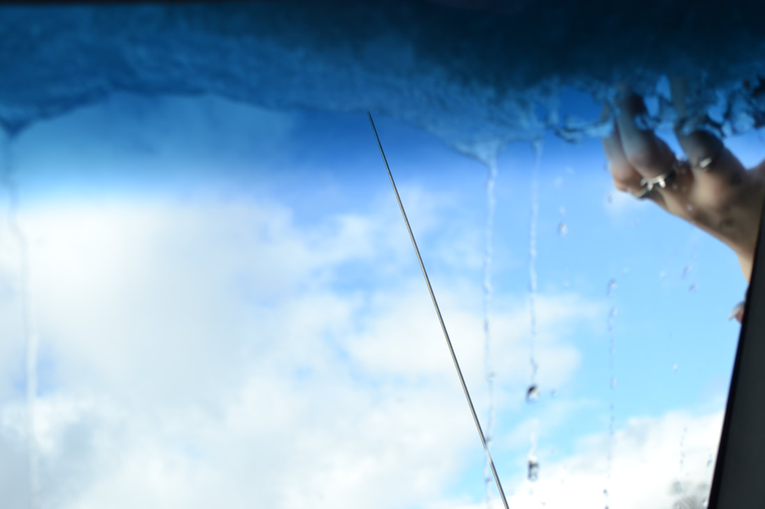
The photos I took for this project was blue things or ice and snow, for some photos I was even able to capture the ice melting, my friend Bailey had just got her nails done to a white blue ombre so it was perfect for this section of the project. So I mainly focused on her hands.
My Edits
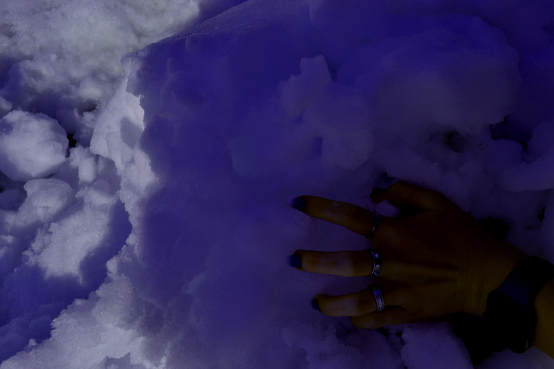
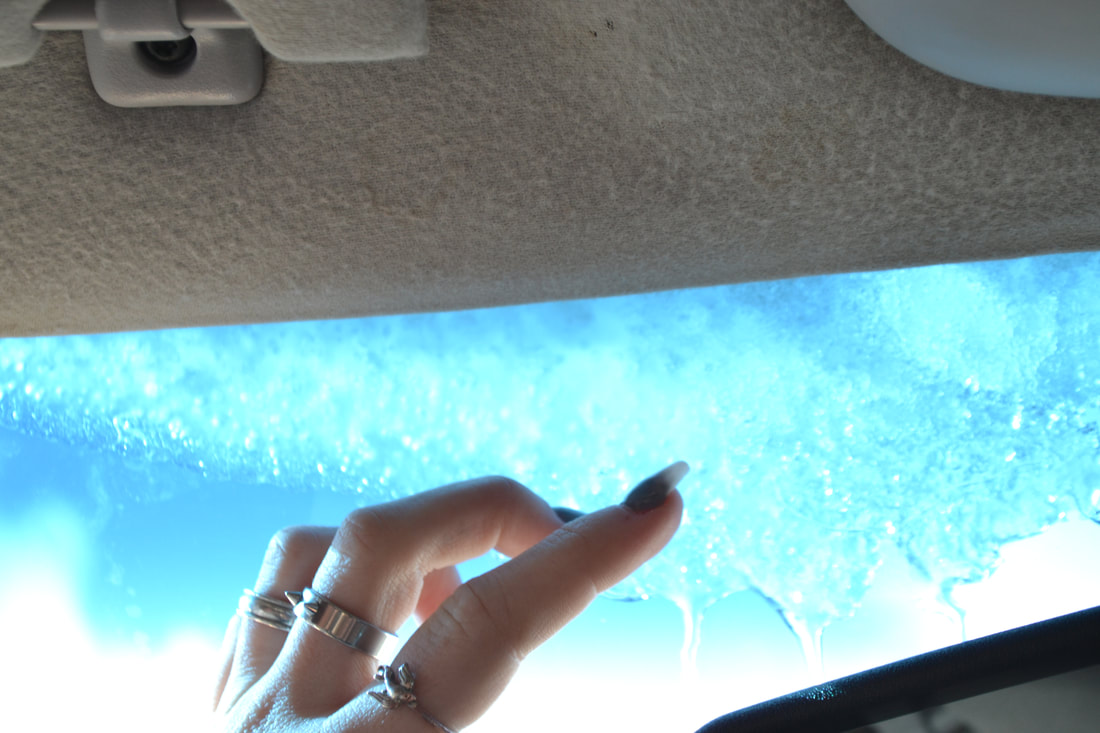
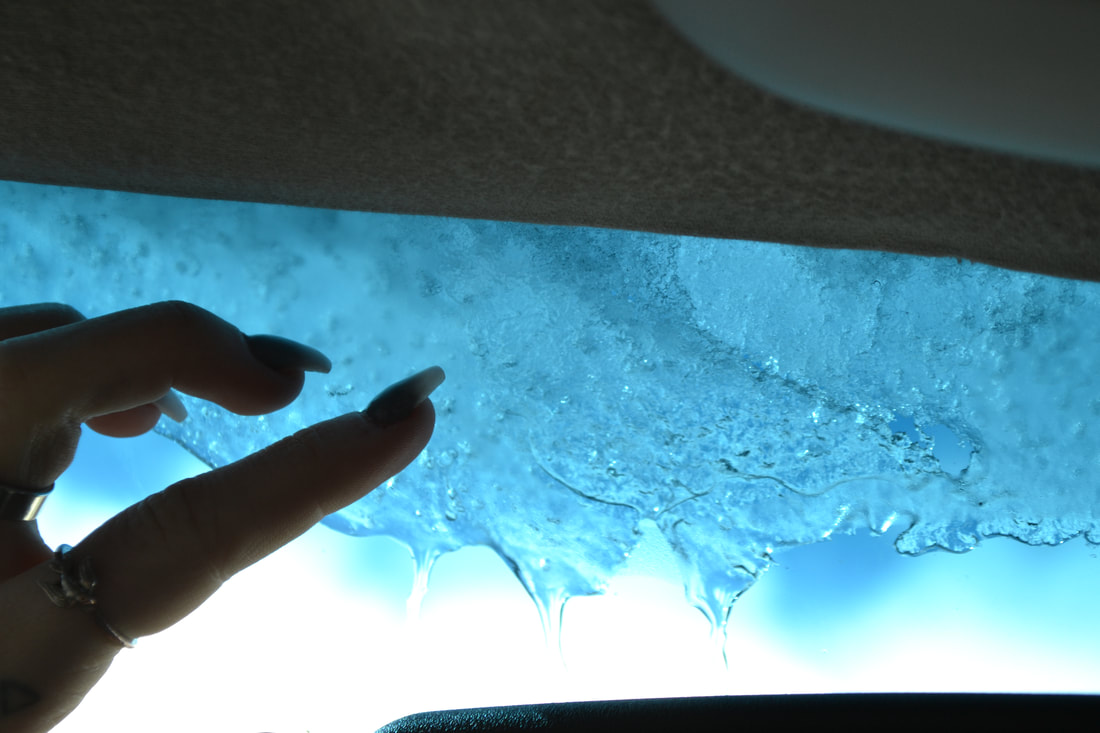
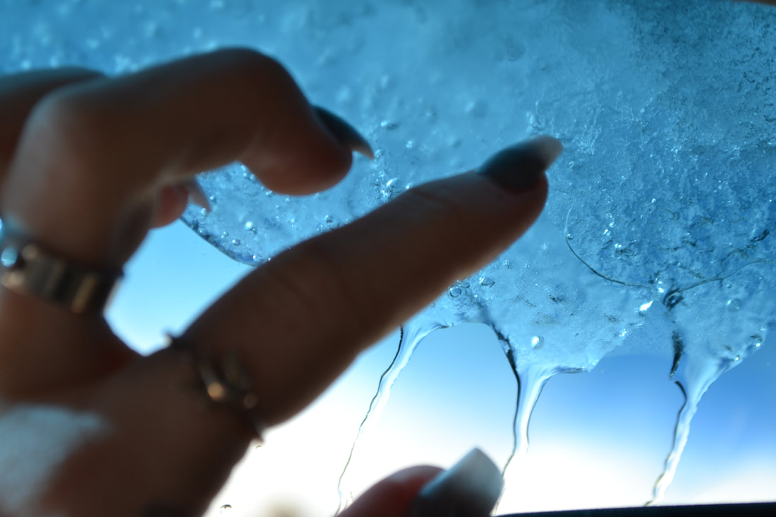
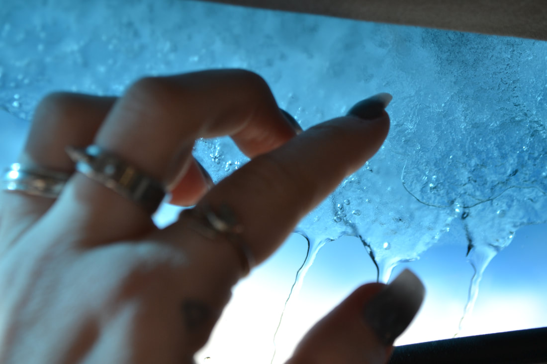
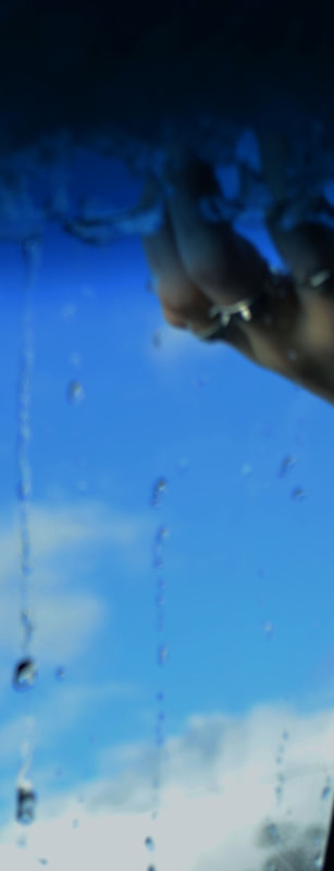
For the editing of this project I enhanced the blues in the photo, for the photo on the far right I had made the water drops sharper so it really enhanced the water affect. Then I high lighted the blues and made them darker, so it enhanced the blue in the foreground and then ombre to a white, much like bailey's nails in the background. The photo in the middle Bailey had stuck her hand in the snow and then I enhanced the purple and blue in the photo so that it added a blue feeling like the other photos. The photo on the far left I had enhanced the rain drops and the ice, then I made Bailey's hand blurry so it drew the viewers eye to the water drops.
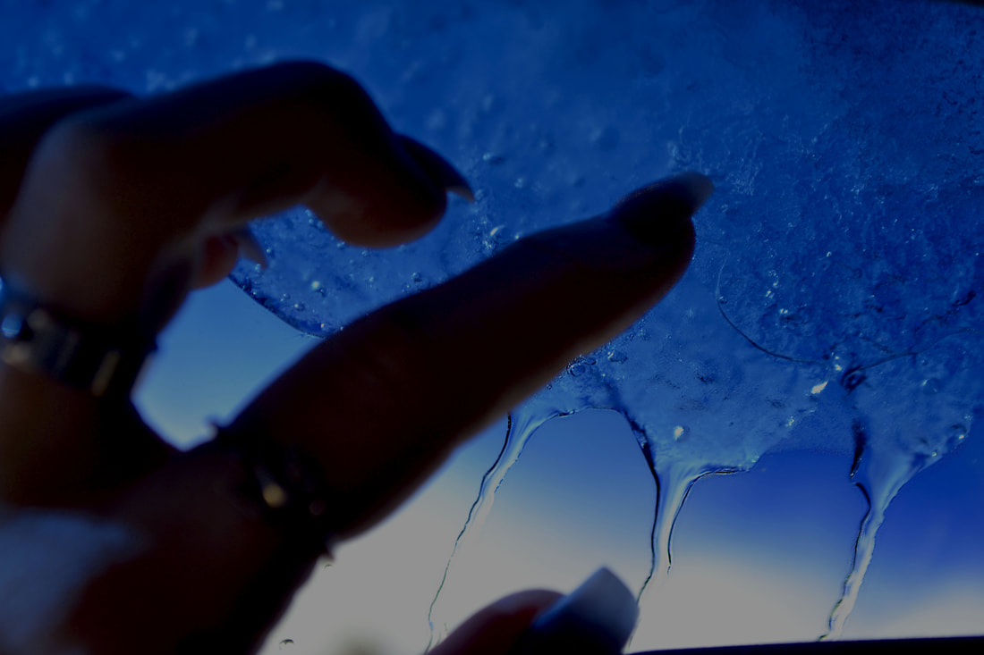
My Final
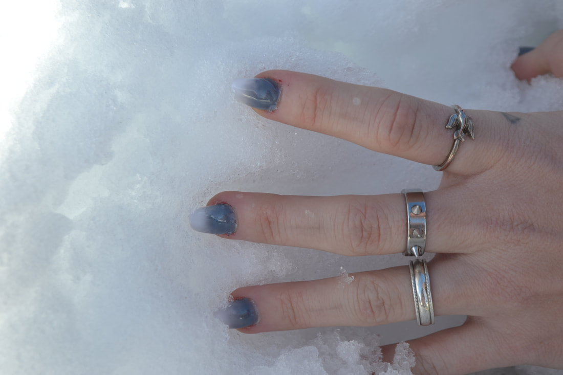
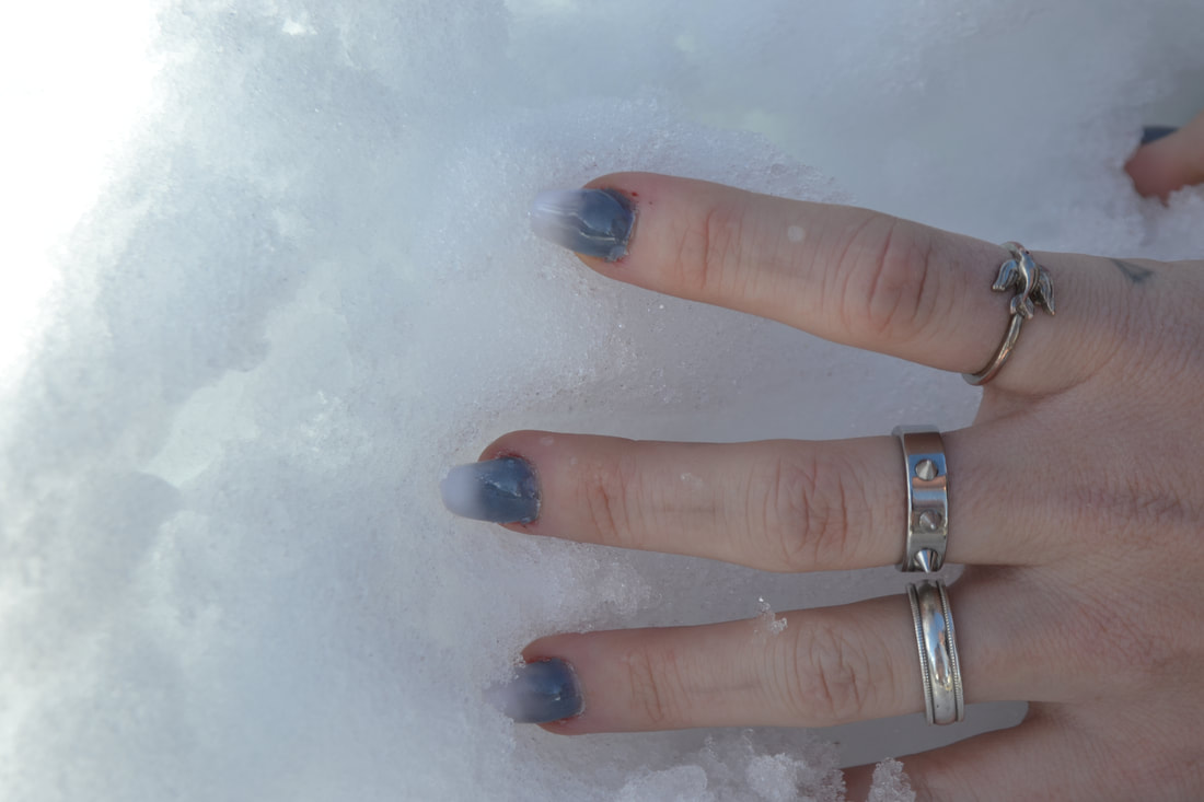
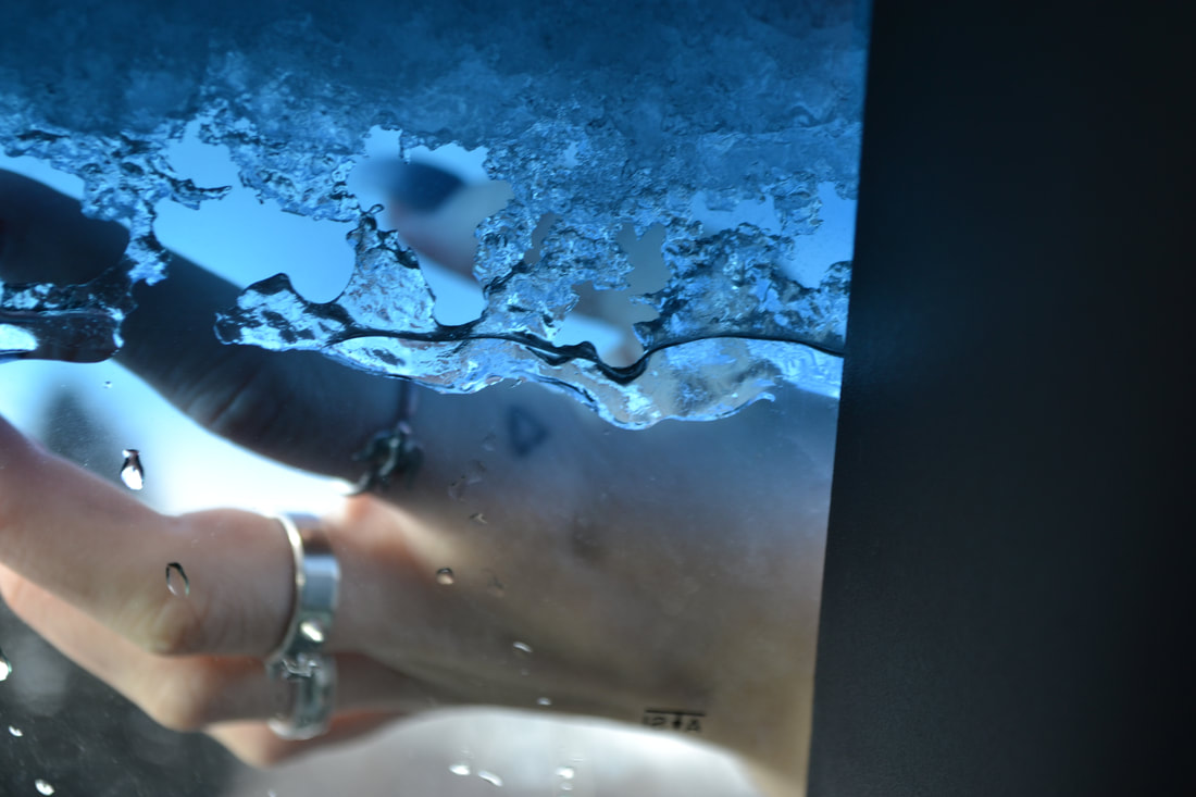
The picture above is a photo I had taken of my friends hand, I like the way that her silver rings looked with the dark blue background. The ice in the photo was melting and I really liked how I was able to capture the ice melting, and the way the water drops look. I had enhanced the blues and sharpened the water drops and edges of the ice to add on affect. An element of art I had used was color to add onto the feeling of mystery and darkness which connects to the principle of design emphasis on how the hand is the only thing that doesn't have one shade of blue. Which is important because without it, it would just look really dull and there wouldn't be anything that contrasts the blue background. Another element of art I had used was texture by the way I had enhanced the rain drops and the ice at the top to help with the texture feeling. This connects to the principle of design contrast because somethings in the photo are in deep focus while Bailey's had isn't. Which is important because without it you wouldn't be able to see how crisp the rain drops are and the main focus of the photo would be something completely different. The interpretation I get from this photo is a the mood of happiness mixed with sadness because of how the rain drops fall down the screen, but it is also happy because of how bright the blue is, and how pretty and clear it looks outside. I think this piece was a success because of how the blues in the photo look so clear and bright, but what I think needs improvement is how I had to cut off part of the photo because of empty space, I think it would have looked better if I had gotten a close up of Bailey's hand.
