Objectives
To take photos in raw form and then transforming them into clearer pictures.
This could be anything with natural light.
Research
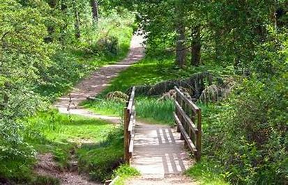
In order to capture natural beauty, you want to focus on lighting (hard light, soft light and the origin of where it is coming from). To make a look that really makes the viewer think that the photo was taken naturally, you want to put the main viewers eye point on something in focus, like a flower or a certain branch coming from a tree. You also want a special element that draws the viewer's attention, a small detail that stands out (example: flowers in a meadow, a stream or pond, a tree or branch that stands out from the rest, ect.). Depth is also a great way to capture a picture, the more in depth it looks the more realistic, you can get this by enhancing what is beyond the main object.
Citation
“How to Photograph Forests and Trees.” CaptureLandscapes, 17 July 2017, www.capturelandscapes.com/photograph-forests-trees/.
|
|
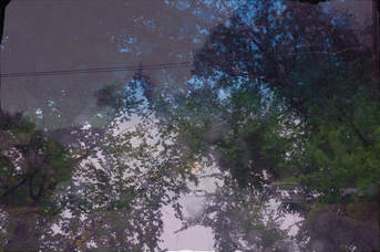
My Twenty Photos
I took these photos whenever I got inspired by the natural beauty around me, when I took pictures of people I tried to keep them candid. I took most of them around my school but I also took some on my way to school. I took some photos of my friend Anneli who posed for me behind a white wall.
My Four Edited Photos
To edit these photos I wanted to make them look as natural as possible, not all the time do cameras capture the real colors of photos. So how I edited these photos was to make the colors really pop and to give it a more natural feel. I wanted to make the photos look like you were there in person.
|

|
|
|
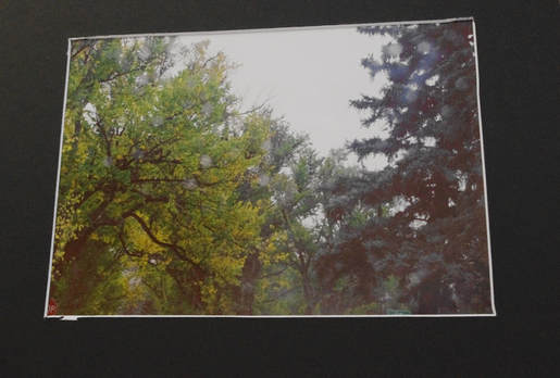
Printed and matted Photo
Five Step Critique
1.Observe
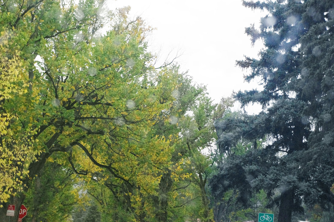
2.Describe: The photo I matted is a 8 by 10 inch with a black border with a white core giving the picture a white balance, which was printed on glossy paper the picture was a photo that I took on my way to school of the trees through a the rainy windshield. In the foreground there are raindrops that were out of focus. In the middle ground there is a red stop sign in the bottom left corner which is halfway out of the frame, in the bottom right corner there is a green bicycle sign which is also about half way out of the frame. There are also trees on both sides of the picture one is yellow and green (left) and the other one was dark blue (right). In the background there are trees with the colors of green and yellow, with a devision between the trees. I edited so that the rain drops are bolder and make more of a appearance. The yellow tree in the background makes the raindrops look more out of focus and as if someone had placed them there on purpose.
3.Analyze: An Element of Design that I used to create this photo was color and the way the yellow made the dark blue pine needles stand out, also the dark sky in the background makes the picture have more of a stormy feeling. The dark clouds as wraps the photo together connecting it both the matting and the feeling that the artist was trying to give creating the emphasis of Elements of Art. Another Element of art that was used is texture, because the yellow and green leafs against each can really make you see the outline of each leaf. This also adds emphasis between the bright colors against each other. Another Element of Design that was used is balance, there is variety because on one side there is bright yellow and green trees while on the other side there are trees of darker colors, such as dark blue and green. This is important because the darker clouds really make these colors pop.
4.Interpret: The interpretation of this is thats its a cold cloudy day that had kinda a tint of sadness but still is bright and sunny, in the photo you can see this because there are darker clouds creating a gloomy look to the picture, which at first your eye travels to the brightness of the trees but then gets dragged up to see the clouds.
5.Evaluate: This photo was successful because of the way all the colors combine and how the photo looks like its raw, and I think this photo really coveys the natural essence of the photo. It makes the viewer feel like they were there when the photo was taken. Although I do believe that I can improve this photo by making the yellow in the photo to more of a autumn color so the viewer feels more like that it's sometime in fall. I also feel that the texture in this photo really makes the viewer feel like they are part of this photo, also the way balance is presented isn't like how most photos use it so it gives the photo a more unique look. I also think this photo was successful because by how they artist wanted to display it, the artist wanted to display it as a cold and gloomy day and that is precisely how its interpreted.
