Objective
My Objective for this project was to edit these photos to make them clear and crisp and to enhance some colors, I also wanted to take a main object, make the colors really pop and turn the background to black and white.
Research
When you have a subject in color and the background black and white what it does is enhances the subject that is in color, and it also draws the viewers eye to the certain subject. The techniques is one of the older techniques, and although I couldn't find much about what the effectiveness of using it is there was a lot of articles about how to do it. Making photos "Clear and crisp" can be achieved through photoshop although most people believe that it is due to the the type of sense that a camera has.
Citation
“How To Make Your Photos Look Clear and Sharp In Photoshop.” Gimme Some Oven, www.gimmesomeoven.com/make-photos-look-clear-sharp-photoshop/.
Cunningham, Matt. “How to Create Black-and-White Photographs with Color Accents.” HowStuffWorks, HowStuffWorks, 21 Feb. 2012, electronics.howstuffworks.com/cameras-photography/tips/how-to-create-black-and-white-photographs-with-color-accents.htm.
Cunningham, Matt. “How to Create Black-and-White Photographs with Color Accents.” HowStuffWorks, HowStuffWorks, 21 Feb. 2012, electronics.howstuffworks.com/cameras-photography/tips/how-to-create-black-and-white-photographs-with-color-accents.htm.
Original Photos
Edited Photos
|
|
Edited and Matted
|
|
Five Step Critique
1.Observe
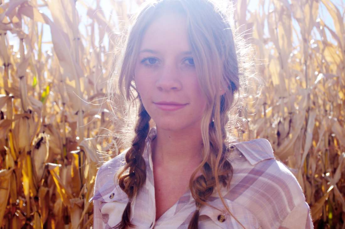
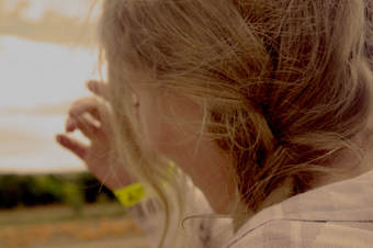
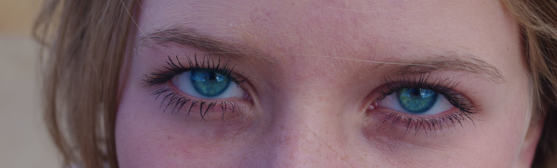
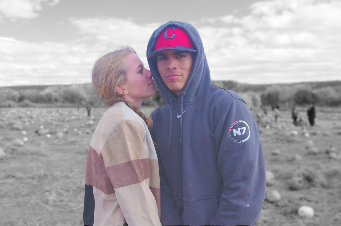
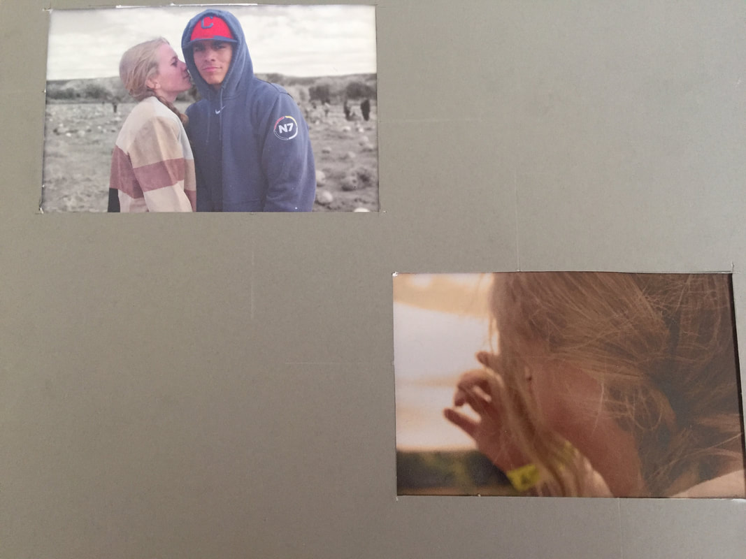
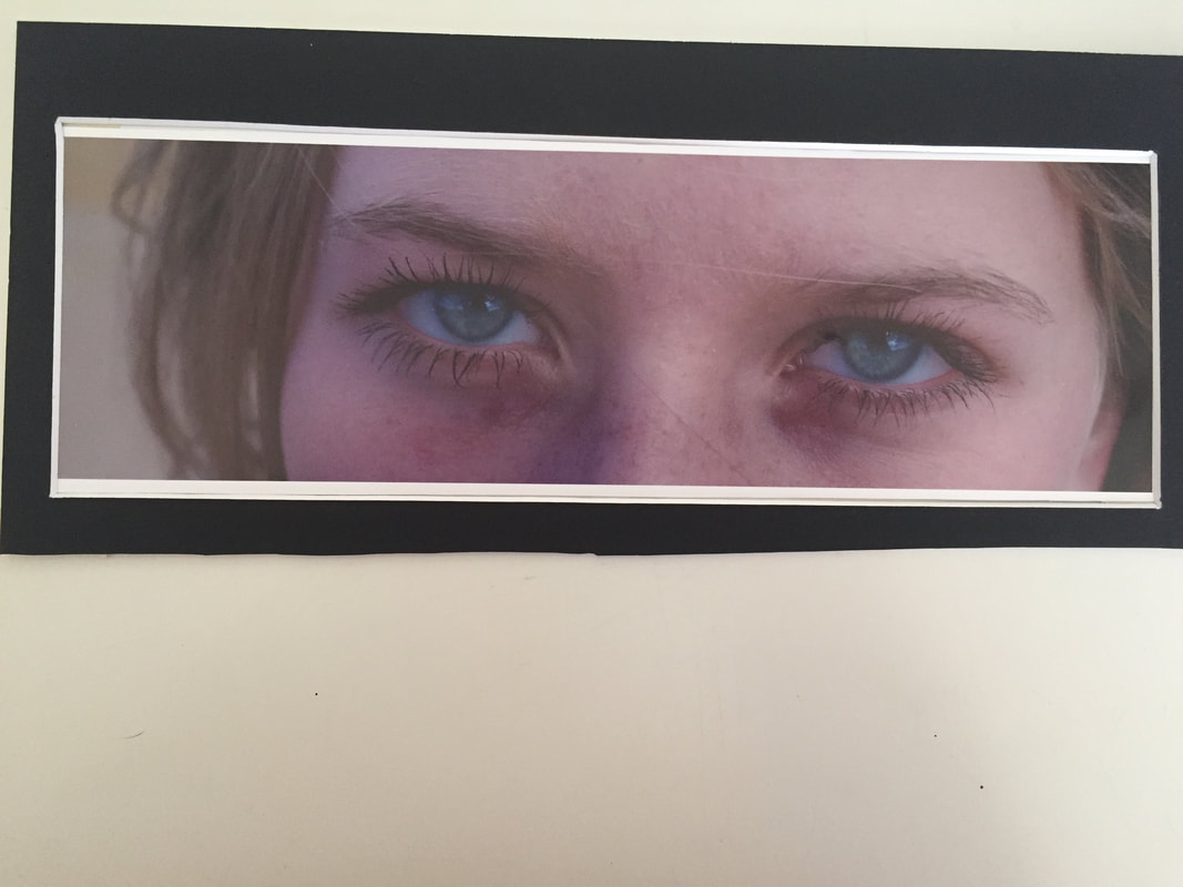
2.Describe: The photos I matted is a 8 by 10 inch with a black border with a white core giving the picture a white balance, which was printed on glossy paper the picture was a photo that I took when me and my family were out on a pumpkin patch, I noticed that my sisters eyes really popped so I took a close photo on her face (right). In the foreground is a piece of hair that blew across her face, in the middle ground you have her eyes which I edited to make a brighter blue and a brighter green. I the background there is my sisters blonde hair which she had braided into pig tails. In the other photo I took (top left, left picture) was of my sister and her boyfriend, this photo I told them to pose together but them being them didn't listen to me. In the foreground is my sister and her boyfriend they are standing next to each other and my sisters face is up against her boyfriends next, they are the only parts in the picture that are colored. In the middle ground is pumpkins that are spread out, I tried to blur the edges so it would seem that the two of them were the only two in the patch. In the background you can make out groups of people walking around the patch and trees in the background. In the last photo I took (bottom right) it was a close up photo of my sister, I wanted to give the photo a warm feeling so when I saw that on the filter, there was a warm filter I didn't hestitate to add it. In the foreground you can see stranded of my sisters hair that was put aside in a messy braided pig tail, while in the middle ground you can see the side of her face and her left hand which has a yellow wrist band on it. In the background you can see the sky which you can barely make out the clouds and then on the horizon you can see the line between the bushes and trees and the sky.
3.Analyze: An Element of Design that I had used for these photos was color, in every photo that I did there was evidence of the way I used color. In the photo on the right I had used color to really empower her eyes I also added a tight of green. also used color in the photo on the left to give the a more of a pop (top left) I had used color to make the two pop against the the black and white background. On the bottom left corner I had sure a warm filter to give the photo a warm feeling. The Elements of Art that I had use was space, value, and shape. In the top left corner (left picture) I had used value to enhance the people and to make them pop, in the bottom left corner I had used shape to enhance my sisters braid and the outline of her face. I the right picture I had used space to make her eyes pop against the emptiness of her skin and the background.
4.Interpret: The interpretation of these photos that I had gotten was a warm feeling, a feeling of a nice fall day that I spent out with my family. I was playful with all the colors that I had used, I really drew emphasis on my sisters eyes when it came to drawing the viewer in I thought I did a good job at making the viewer see the ocean blue eyes with the tint of evergreen. It also added to feeling that it was a fun day out in the sun, picking pumpkins and enjoying the weather. The feeling I had gotten that day I thought was well represented in the photo on the left (bottom left).
5.Evaluate: This photo was successful because of the way all the colors combine and how the photo looks like its raw, and I think this photo really coveys the natural essence of the photo. It makes the viewer feel like they were there when the photo was taken. Although I do believe that I can improve this photo by making the photo in the top left corner more raw and realistic, I could do this by taking the photo and dulling it down. I think the bottom left corner photo could be improved by making the hair in the photo really pop, and making it bolder although I still believe that that photo was a success. The photo on the right I thought was very successful, the way her eyes popped and the way I was able to go in deep and get all the little pieces of mascara that had dropped. In this photo I think I had taken it as far as it could go, although in both photos the matting could be deeply improved.
