My Projecy
This is the second part to my elements piece, for this project I tried to capture green, whether or not its with photoshop.
My photos
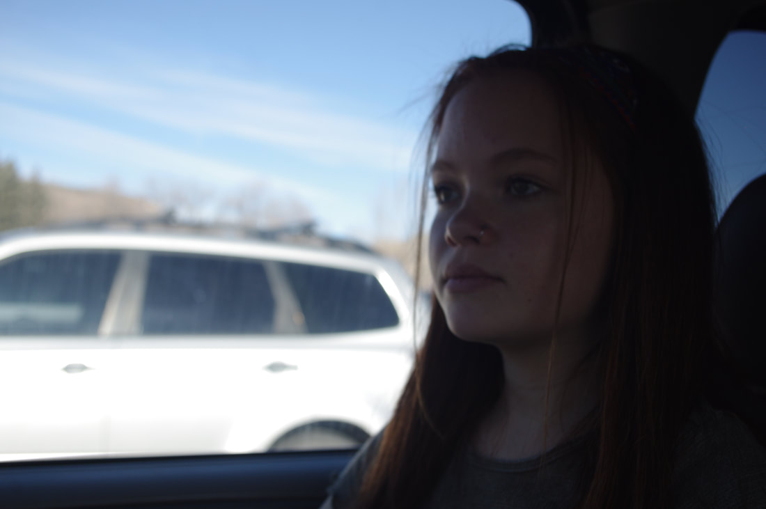
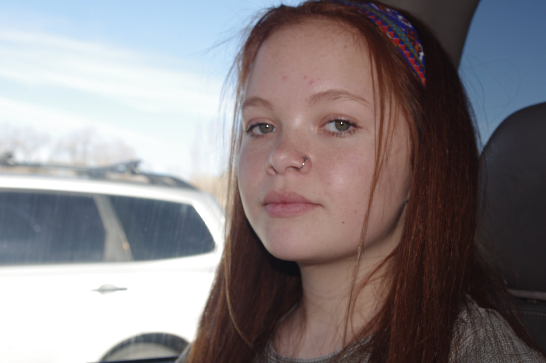
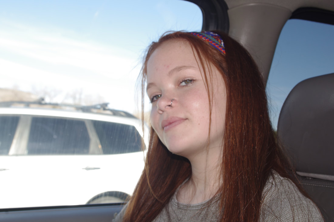
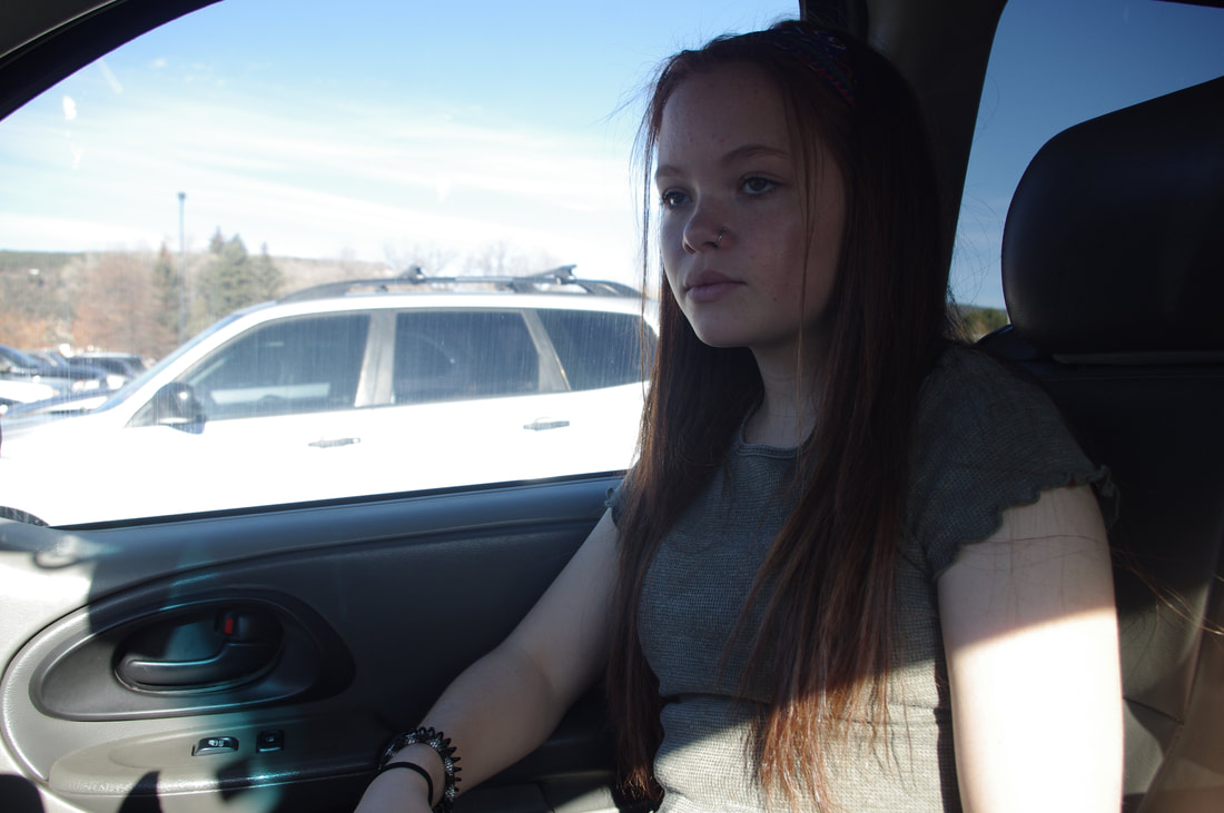
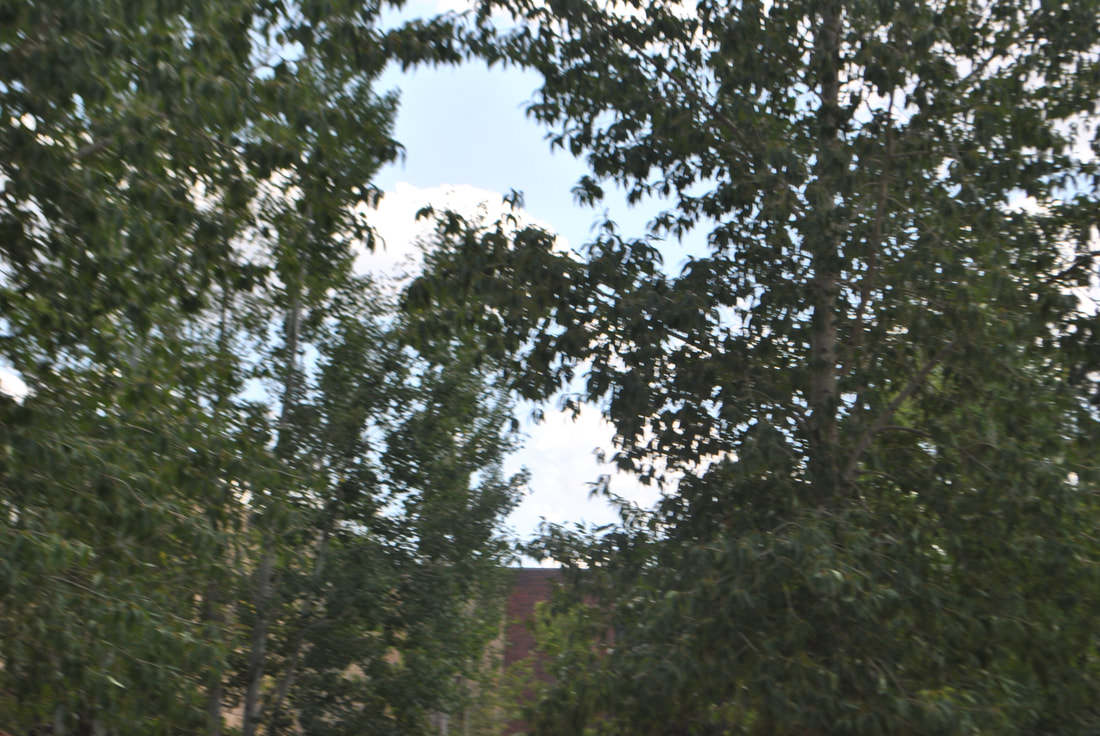
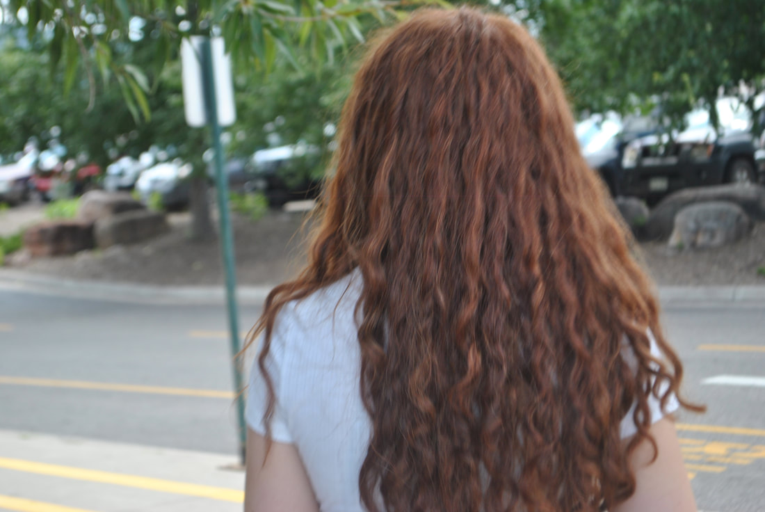
For this portion of my project, I decided to take photos of things involving the color green, I really like Bailey's eyes for this part because I thought the way her red hair and her green eyes really complimented each other. Bailey one day was wearing a green top and a green and blue head band so I thought it would be perfect for this section of the project.
My edits
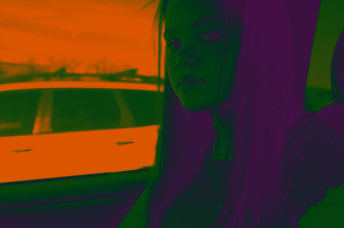
For editing I wanted to make the greens in the photo enhanced so it was very visible, for the photo on the far left I had enhanced the green in Bailey's shirt so it popped out more, then I had enhanced her eyes so they matched the shirt. Then I changed her lip color to darker so that way it didn't draw as much attention as the last photo, and that way it also went along with her bright green shirt and eyes. For the photo in the middle I had used the gradient layer to make the entire photo green and purple and orange, then I played around with it to make the green dominate. For the photo on the far right I had wanted to go with a more subtle green, so I had only enhanced the green in Bailey's shirt to a light green, but I was also able to edit the head band her head instead of her eyes, so that way the blues and greens in the head band were enhanced.
My Final
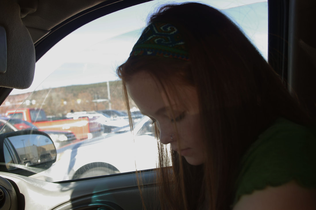
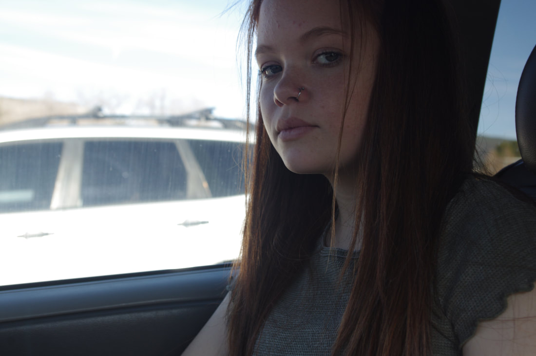
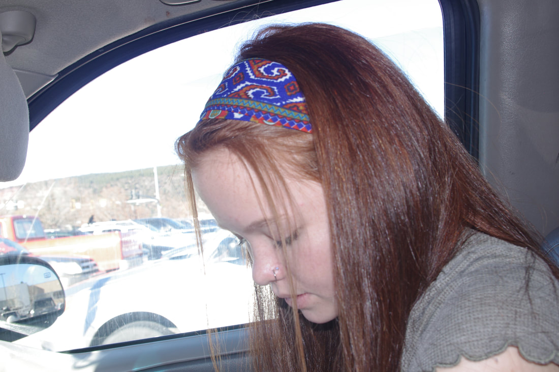
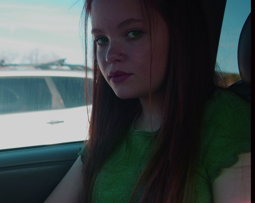
The photo above is a photo of my friend Bailey she's looking down at her arm her hair is pulled back by a headband, the photo was taken in my car in a parking lot. I liked the way her green shirt matched her green and blue headband I also liked how her eyelashes look so long and fanned out. This photo uses color because of how the green in the headband matches the green in the shirt, this connects to balance because of how her shirt is at the bottom of the picture and her headband is at the top. This is important because because it draw the viewers eye up and down the picture and how the main object (Bailey) is in the middle, so the viewers eye has to go directly through Bailey's face. The also helps with the element of art Space because of how the green is very faint but it is still enhanced to it draws the viewers eye to Bailey and not the empty space in the photo. This connects to the principle of design proportion because of how the colors evenly proportion on either side of Bailey's body. Which is important because because it wouldn't provide unity within the photo without it. The mood I get from this piece is sadness because of how Bailey's eyes are slanted down and barely open. I think this piece was successful because of how the green is evenly proportioned throughout the photo.
