Chicken |
A Blast From the Past
|
Hollow Box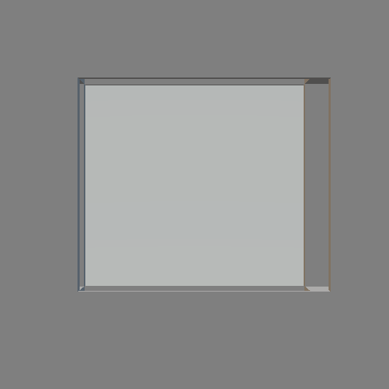
|
Artist Statement
Left
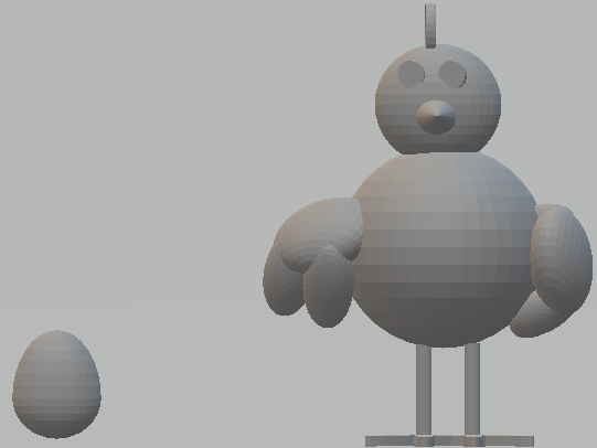
The photo on the left is a picture of a chicken that me and my friends had decided to do and make a friendly competition out of it using the requirements, which for this project was to create a key chain. I had done this by adding a loop on the top of the chicken, I had made the chicken wings by going into the character section and using the hands they had given and flipping them upside down and slanting them outwards to add the wing effect. I had used the same method on the tail, for the eyes I had used the circle tool and flatten it. for the nose I had taken a sphere and extended it outwards, I was able to find the legs in the character section along with the egg. For the head I had just used the circle tool and placed it on top of the head.
The element of art I had used for this piece was shape to help form the chicken, using different shapes and designs to create that effect. The principle of design I had used was unity to create the look of a chicken, this is important because without it the chicken wouldn't look like a chicken at all. I had used form to create the different aspects of the chicken, the principle of design I had used was balance by how there is something surrounding both ends of the chicken and on either side. This is important because without it, it would look un-proportional.
The concept of this piece was to create something that was fun and would bring back good memories every time I looked at it. I thought I was able to complete this by making it with my friends in this class and also by creating something that was wacky and not what a typical person would think of while creating a key chain. Another concept I got from this piece was the idea behind it which was just creating a chicken, although many people might not be able to see that we had done it as a group.
Overall I believe this piece was a success because of how you can really tell what the artist was trying to portray, it does need improvement however with how the face is all un-even.
Middle
The photo in the middle is a photo a name that was imprinted on a flat back board that says "That 70s show" my plan for this one was to paint each letter a different color embarking the tv show That 70s show more emphasis on where the title came from. Also to give it more of that old timey feeling hence where I had gotten that name, A Blast From the Past I also planned on painting the background red one of the many color themes from that 70s show. The objective for this project was to create a name embedded into something, whether it's a name of someone or the name from something you know.
The key element of art I had used was shape because of how each letter was shaped, which uses the principle of design emphasis because of how each letter is placed slightly over the background. This is important because without it it would just be a flat rectangle. Another element of art I had used was texture because of how each letter stands off of the background which uses the principle of design rhythm with how you read something right to left. This is important because without it it would just be a flattened rectangle with no meaning.
The theme of this piece was to create something that both says That 70s Show but also takes aspects from the tv to incorporate into the piece, I was able to do this by writing on the rectangle slab that 70s show and then by painting it colors that correspond with the theme of the show. I also get the message from this piece that it's happy because of all the bright colors I tend to use with the piece.
I thought overall this piece was successful because it had displayed what I wanted it to but what I believe needs improvement is creating it into a key chain or something so I'm able to use it everyday. However I do enjoy the final outcome of the project because it had displayed what I wanted it to in a simple way yet connected to the tv show but someone would have never guessed if they hadn't seen the show before.
Right
The photo on the right is a piece I had done that was a box but hollow, so the only visible parts of the box was the edges, of each corner of the box. My plan was to paint each edge red and make it into a necklace, that was simple but also something that I could wear often. The objectives in this project was to create an object that had negative space, I thought I meet the objective well because I was able to incorporate negative space into an object that was elegant but simple. A key skill I had learned while doing this project was patient because it took me a while to get each part of the box that's hollow was equal on all sides.
A key element of art that I had used was space because of how the box is hollow, a key principle of design I had used was emphasis because of how each corner of the box is emphasized because of all the negative space around it. This is important because without it the box would be like any ordinary box with nothing unique about it at all. Another element of art I had used was line because of how the box is outlined, which reflects the principle of design balance because of how each edge is perfectly balanced between each other. Which is important because without it, it would look unproportioned.
The purpose of this piece I believe is to create something that was simple and something I could and would use everyday. I believe this because of how simple the design is yet when you really looked at it, would make your mind to wonder what was the true purpose of this piece, what was the intent? The theme I believe of this piece simplicity because of how simple the design is, I did enjoy creating this project although it got frustrating when my pieces kept deleting and then I would have to recreate the design again from scratch.
Overall I believe that this piece was successful because if it had the chance to be printed I would wear it often, for the sole purpose of how simple it is and how easy it would be to pair with outfits. I think it needs improvement because some of the sides are uneven and even though it's not very noticeable to the innocent eye. I do however enjoy the final outcome because it is something that I would wear often, which was my main goal in the end of this class; to create something that I would wear often.
