Objective
The objective I had chosen for this project was the way lighting affects the different shadows and appearances of someone's face.
Research
The different kinds of lighting on a photo can effect how the viewer feels, it can really help set the mood in a photo. Which artist often use to their advantage, lighting can also change the appearance of something, such as it's size or the color that it is. Which that can also make it difficult to take a photo when the room is dark but outside is light because the contrast on the photo would be to much and outside would draw the viewers attention instead of the main focus.
Citation
“How Does Light Impact Your Photography?” ShootTokyo, 7 July 1970, shoottokyo.com/blog/light-impact-photography.
Original photos
|
|
|
|
Edited and Matted Photos
|
|
Five Step Critique
1)Observe.
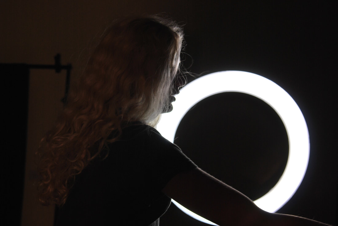
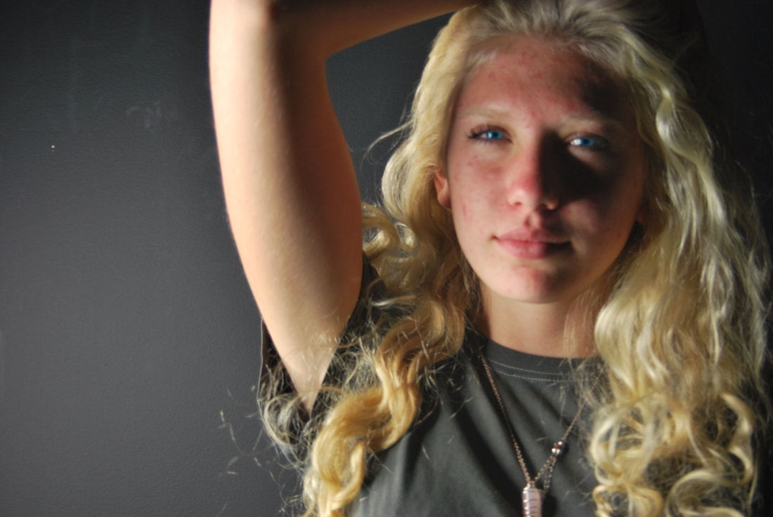
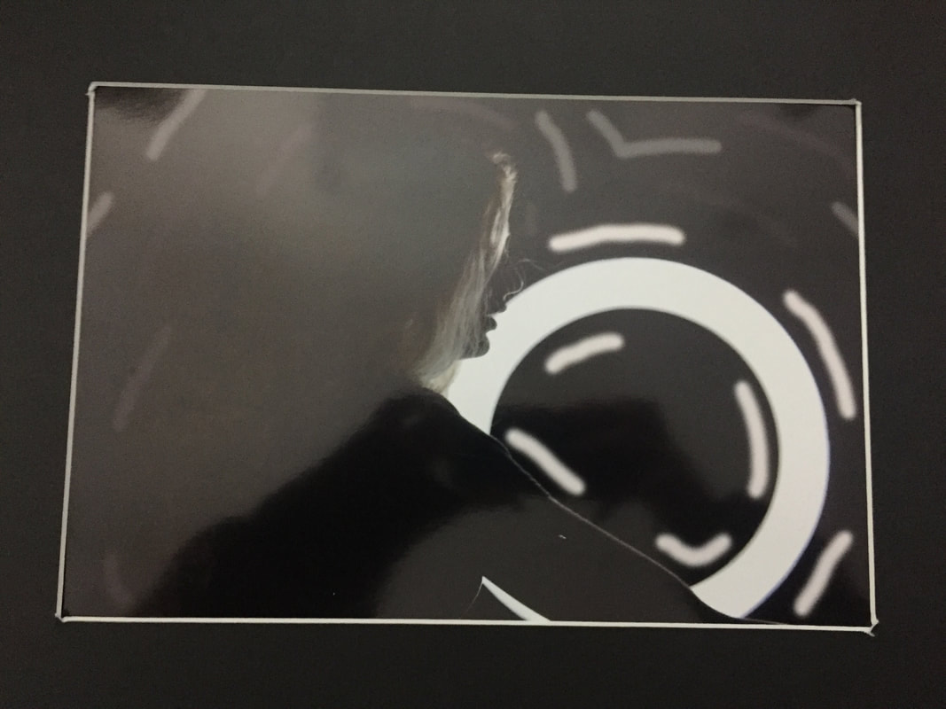
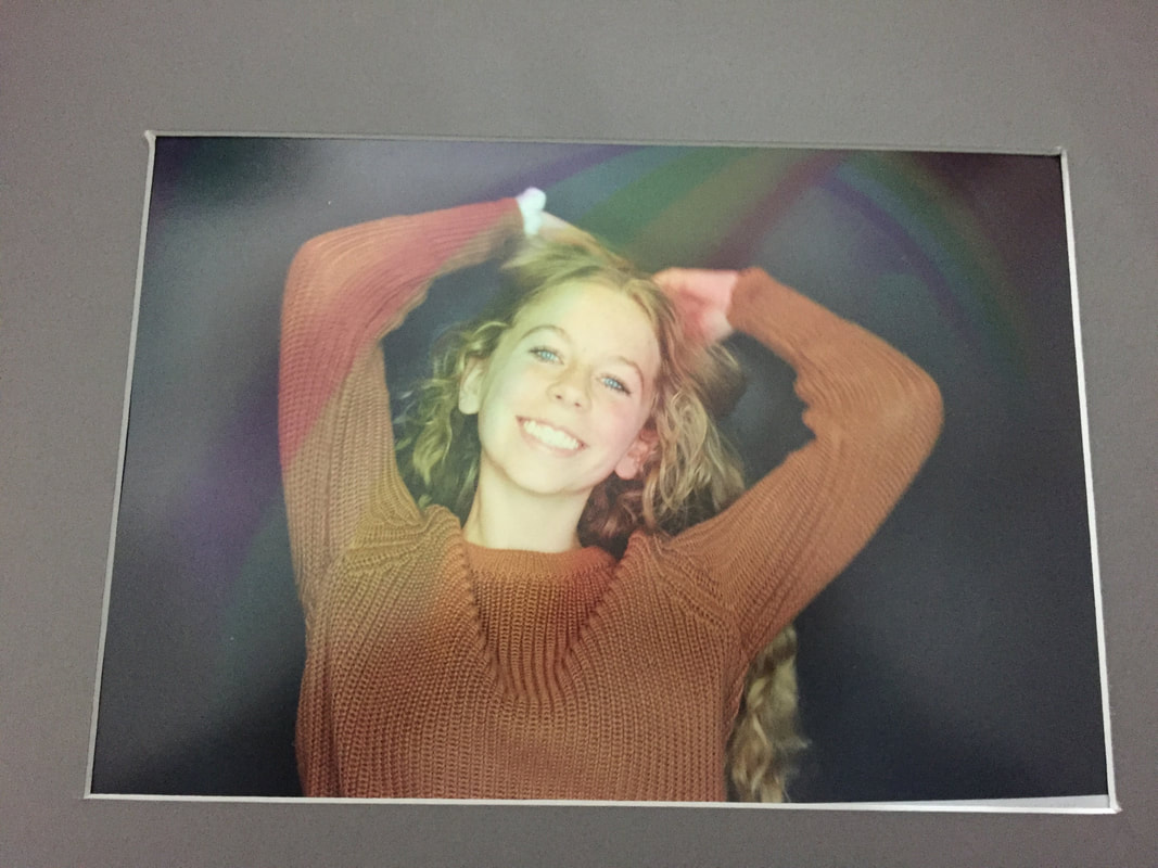
2)Describe: The picture on the top left was taken in the light studio, which in the background there was the ring light which we had used for lighting. Then in the foreground it is Juliana which her bleach blonde hair looks extra white in the photo, I had also drawn lines around all the main parts of the photo. It is a 8 by an 11 inch pearl grey paper, with black matting and a white core. The picture on the right side was printed on 8 by 11 inch paper where it is a portrait of myself smiling and pulling my hair up on either side. With a rainbow across my face with a low opacity so it is barely seen, My eyes have also been photoshopped to make them bluer and I also changed the
3)Analyze: Out of the elements of art that I used line and color, I used line on the picture on the left when I had used the brush tool to emphasis the main object. I had used color on the picture on the right because when I had applied the rainbow I also enhanced the blue in the both the rainbow and my eyes this was also used because I had enhanced each color of the rainbow to make it brighter and bolder which gave it a unique look against the orange sweater I was wearing. I also used color with the photo on the right because of the way I had only used shades (black, white, and grey) to make the photo have a more dark and mischievous look. The principles of design I had used were unity and pattern, unity was used in the photo on the right because of the way all the different colors collided with each other, and how I had taken light colors and paired it with a more autumn brown color and how the whole photos looks put together. I had also used pattern with the photo on the left because of how the lines shaped around the main object and created a pattern forming around it.
4)Interpret. The interpretation I had gotten from these photos are a happy feeling, which I thought I had done a well job with showing with the picture on the left because not only did I make my smile bigger but I had also placed a rainbow across my face which gave the photo more color, which brightens up the picture and glows up the photo, the smile on the photo also makes the viewer think that the photo was taken at a happy time in the persons life. The interpretation with the photo on the right was more of a gloomy photo which I thought was presented well with how the different colors of grey white and black of the lines I had used to shape around the main objects also the way that the entire photo was black and white.
5)Evaluate. These photos I thought were a success because of the way both photos represent how the author was feeling, the photo on the right could use some touching up when it comes to Juliana's hair because I believe that if I would have made it brighter it would have drawn emphasis to both the light fixture and her hair. The photo on the left I thought was a success because of how all the colors and how the collab together this photo could be improved because I could have added a blue or green filter which would had drawn the viewer even more to the eyes and also it would have added a nice color to the rainbow too.
